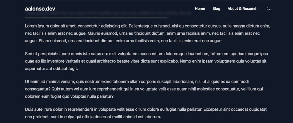
Hello everyone, today I just want to share two code snippets for those that might find it useful. I have always like how the reading progress bar look in the blogs, so I build my own one for my own tech blog (this blog!). Each article in my blog has the same behavior, with a reading bar in the top of the page, the header, that fills as you scroll down. You can check how it works by scrolling down in this page.
My blog was initially built on top of Next.js with React, but later I moved to Nuxt.js and Vue, so I had to rewrite my component, and that’s why I have both versions.
Okay, let’s stop talking, here is the code!
React component
Here is the React component:
// File: src/components/ProgressBar.tsx
import React, { FC, useEffect, useRef } from "react"

type ProgressBarProps = {
  enabled?: boolean
}

const ProgressBar: FC<ProgressBarProps> = ({ enabled = false }) => {
  const progressBar = useRef<HTMLDivElement>(null)

  const updateProgressBar = () => {
    const winScroll = document.body.scrollTop || document.documentElement.scrollTop
    const height = document.documentElement.scrollHeight - document.documentElement.clientHeight
    const scrolled = (winScroll / height) * 100
    if (progressBar && progressBar.current) progressBar.current.style.width = scrolled + "%"
  }

  useEffect(() => {
    if (progressBar && progressBar.current) progressBar.current.style.width = "0"
    if (enabled && typeof window !== typeof undefined) {
      window.addEventListener("scroll", updateProgressBar)
      return () => window.removeEventListener("scroll", updateProgressBar)
    }
  }, [enabled])

  return (
    <div className="w-full h-0.5 bg-transparent">
      <div className="w-0 h-0.5 bg-txt-color-bright" ref={progressBar}></div>
    </div>
  )
}

export default ProgressBar
I was using it back then as a part of the header, but was only visible on the articles, like so:
// File: src/components/Header.tsx
import ProgressBar from "./ProgressBar"

const Header: FC = () => {
  return (
    <header className="fixed top-0 w-full z-20">
      <nav className="border-b border-border-color">{/*...*/}</nav>
      <ProgressBar enabled={router.pathname === ROUTES.article} />
    </header>
  )
}

export default Header
Vue component
And here is the current Vue version as the date of writing this article:
<!-- File: components/article-progress-bar.vue -->
<template>
  <div class="w-full h-0.5 bg-transparent pb-1">
    <div ref="progressBar" class="w-0 h-0.5 bg-primary" />
  </div>
</template>

<script setup lang="ts">
import { ref, onMounted, onUnmounted } from "vue"

const progressBar = ref<HTMLDivElement | null>(null)

const updateProgressBar = () => {
  const winScroll = document.body.scrollTop || document.documentElement.scrollTop
  const height = document.documentElement.scrollHeight - document.documentElement.clientHeight
  const scrolled = (winScroll / height) * 100
  if (progressBar.value) progressBar.value.style.width = scrolled + "%"
}

if (progressBar.value) progressBar.value.style.width = "0"

onMounted(() => {
  if (typeof window !== "undefined") {
    window.addEventListener("scroll", updateProgressBar)
  }
})

onUnmounted(() => {
  if (typeof window !== "undefined") {
    window.removeEventListener("scroll", updateProgressBar)
  }
})
</script>
And again, I’m using it directly in the header:
<!-- File: components/header-component.vue -->
<template>
  <header
    class="fixed inset-x-0 top-0 z-[1] px-4 sm:px-10 backdrop-blur-sm bg-base-100/80 dark:bg-base-100/80 max-w-6xl mx-auto"
  >
    <nav class="py-2 md:py-6">
      <!-- ... -->
    </nav>
    <ArticleProgressBar v-if="route.path.match(/^\/blog\/\d{4}\/[^/]+\/?$/)" />
  </header>
</template>

<script setup lang="ts">
const route = useRoute()
</script>
That’s all. Short and to the point! I hope it helps you make your own reading progress bar for your site!

